http://romain.vuillemot.net/
A full list of my projects and publications is availble at http://romain.vuillemot.net/ with related code source and materials (usually videos and screenshots). And of course interactive prototype you can play with.
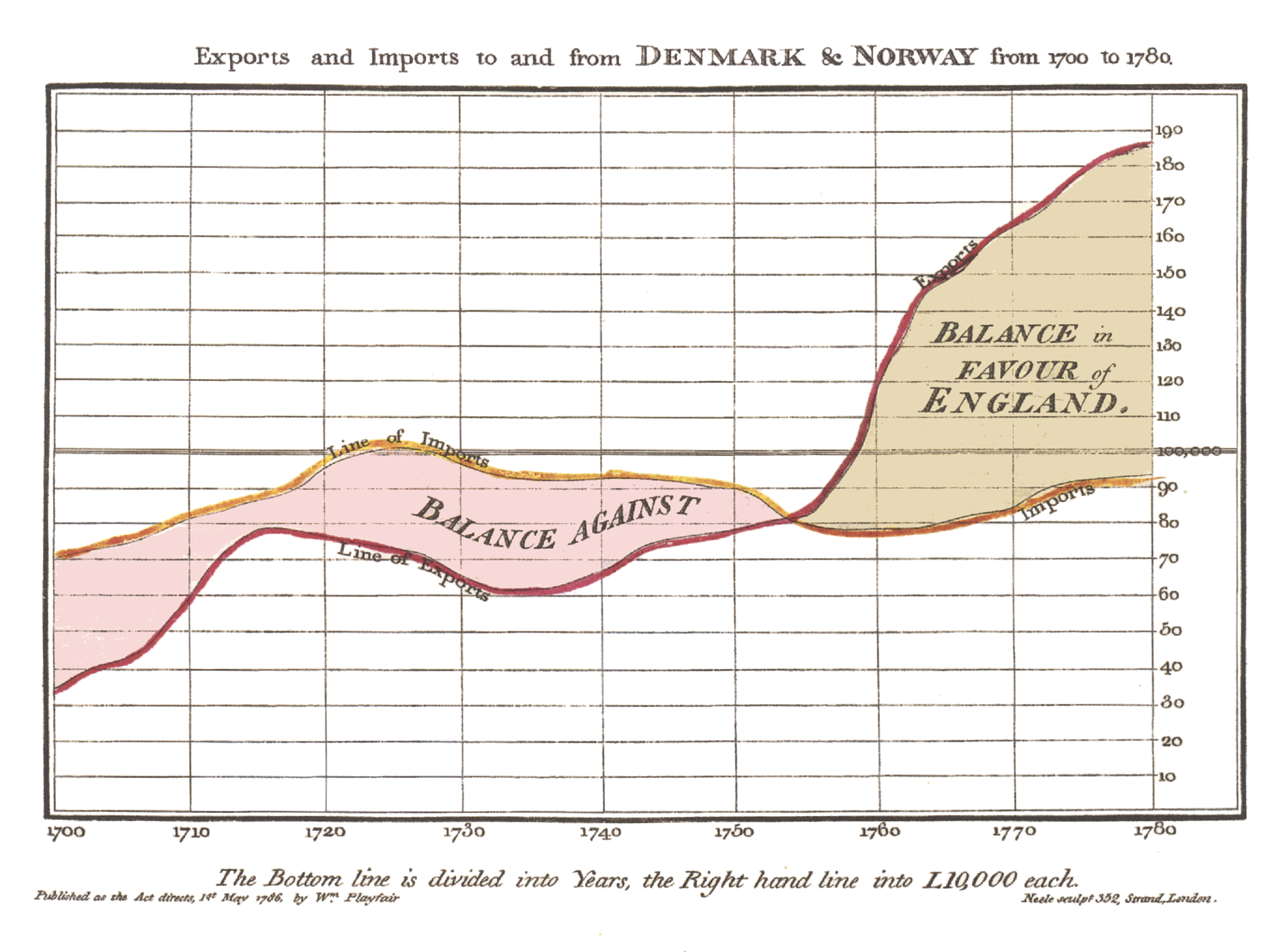
What is data visualization?
Joseph Minard
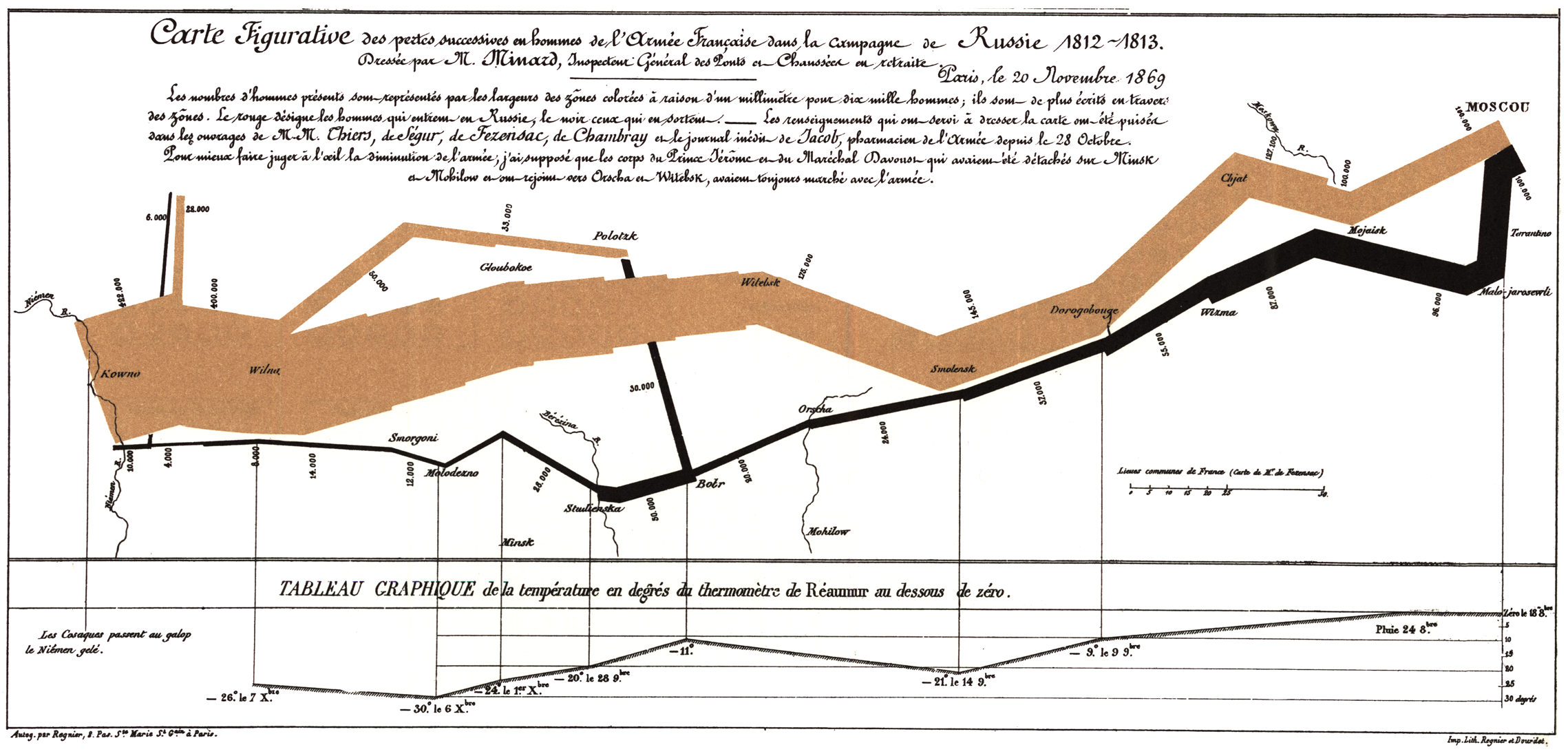
Carte figurative des pertes successives en hommes de l'Armée Française dans la campagne de Russie 1812-1813 https://en.wikipedia.org/wiki/Charles_Joseph_Minard
Joseph Minard
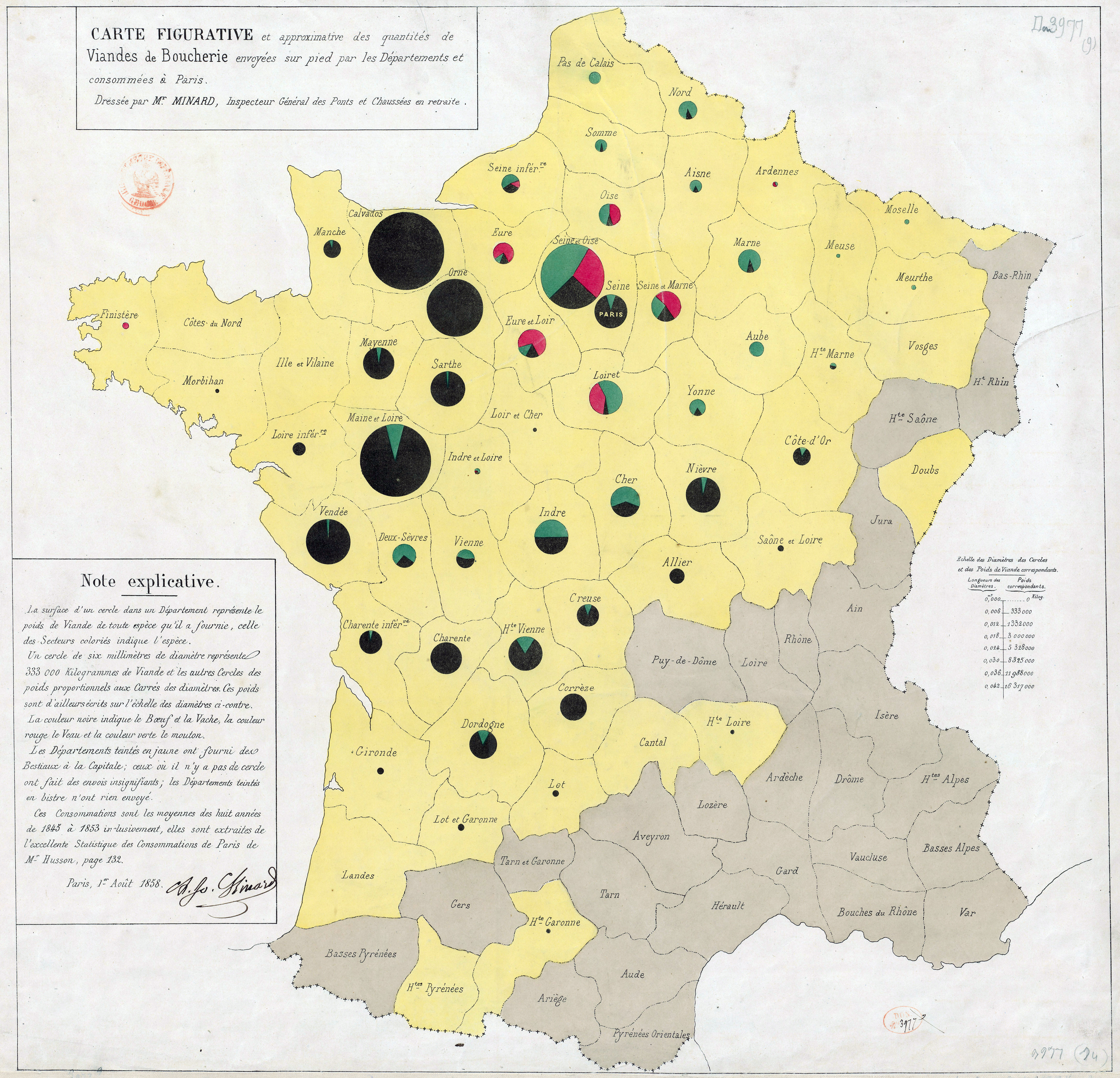
Carte figurative et approximative des quantités de viandes de boucherie envoyées sur pied par les départements et consommateurs à Paris. source: https://en.wikipedia.org/wiki/Charles_Joseph_Minard
Why visualize?
Let's just automatically find the minimal value using scipy
import numpy as np
import scipy.optimize as opt

objective = np.poly1d([1.3, 4.0, 0.6])
x_ = opt.fmin(objective, [3])
print("solved: x={}".format(x_))
%matplotlib inline
import matplotlib.pylab as plt
from ipywidgets import widgets
from IPython.display import display

x = np.linspace(-4, 1, 101.)
fig = plt.figure(figsize=(10, 8))
plt.plot(x, objective(x))
plt.plot(x_, objective(x_), 'ro')
plt.show()

Example #2
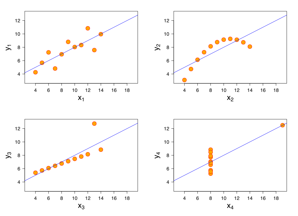
Find interesting patterns in those 4 datasets with eleven (x,y) points.
| I | II | III | IV | ||||
|---|---|---|---|---|---|---|---|
| x | y | x | y | x | y | x | y |
| 10.0 | 8.04 | 10.0 | 9.14 | 10.0 | 7.46 | 8.0 | 6.58 |
| 8.0 | 6.95 | 8.0 | 8.14 | 8.0 | 6.77 | 8.0 | 5.76 |
| 13.0 | 7.58 | 13.0 | 8.74 | 13.0 | 12.74 | 8.0 | 7.71 |
| 9.0 | 8.81 | 9.0 | 8.77 | 9.0 | 7.11 | 8.0 | 8.84 |
| 11.0 | 8.33 | 11.0 | 9.26 | 11.0 | 7.81 | 8.0 | 8.47 |
| 14.0 | 9.96 | 14.0 | 8.10 | 14.0 | 8.84 | 8.0 | 7.04 |
| 6.0 | 7.24 | 6.0 | 6.13 | 6.0 | 6.08 | 8.0 | 5.25 |
| 4.0 | 4.26 | 4.0 | 3.10 | 4.0 | 5.39 | 19.0 | 12.50 |
| 12.0 | 10.84 | 12.0 | 9.13 | 12.0 | 8.15 | 8.0 | 5.56 |
| 7.0 | 4.82 | 7.0 | 7.26 | 7.0 | 6.42 | 8.0 | 7.91 |
| 5.0 | 5.68 | 5.0 | 4.74 | 5.0 | 5.73 | 8.0 | 6.89 |
The Anscombe's quartet.
All points nearly have identical simple statistical properties:
| Property | Value |
|---|---|
| Mean of x | 9 |
| Sample variance of x | 11 |
| Mean of y | 7.50 |
| Sample variance of y | 4.122 |
| Correlation | 0.816 |
| Linear regression line | y = 3.00 + 0.500x |
Not so identical, visually.
Why is it difficult?
Take some time finding the best way to visually represent those two quantities:
See the full list in 45 Ways to communicate two quantities by Santiago Ortiz
Visualization as.. a combinatorial problem
Line, Circle, Rectangle, .. (Graphical Marks)
$\times$ Position, Size, Color, .. (Properties)
$\times$ Selection, Binning, Aggregation, .. (Data transformation)
$=$ Huge number of permutations (even for small and simple datasets)
What to optimize? How to evaluate?
Some principles allow to reduce the size of the space and directly jump to interesting points
Otherwise, no automatic rules to generate a visualization: each visualization has a specific role, efficiency in a given context.
Gestalt / theories of visual perception
Humans visual system has a natural hability to generate similarity, continuation, closure, etc. among visual elements.

Chart junk
Uncessary (?) use of decorations/ornament that can impair readability (but increase engagement, memorability, branding).

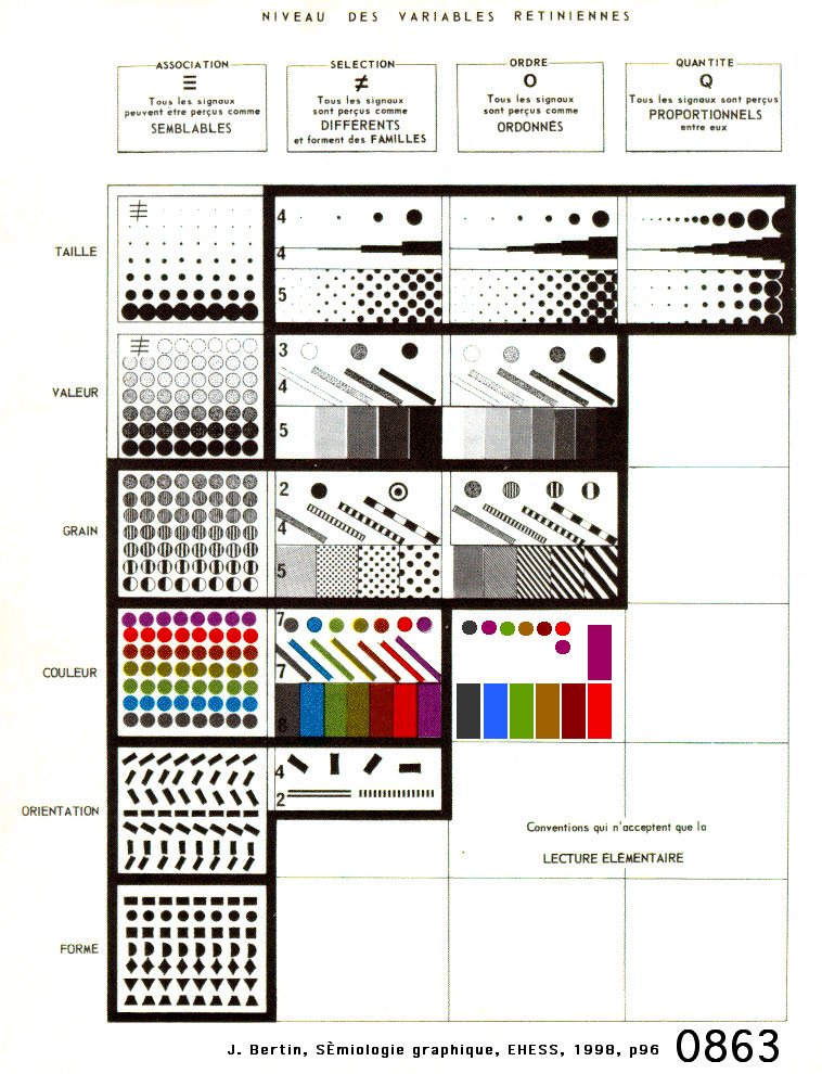
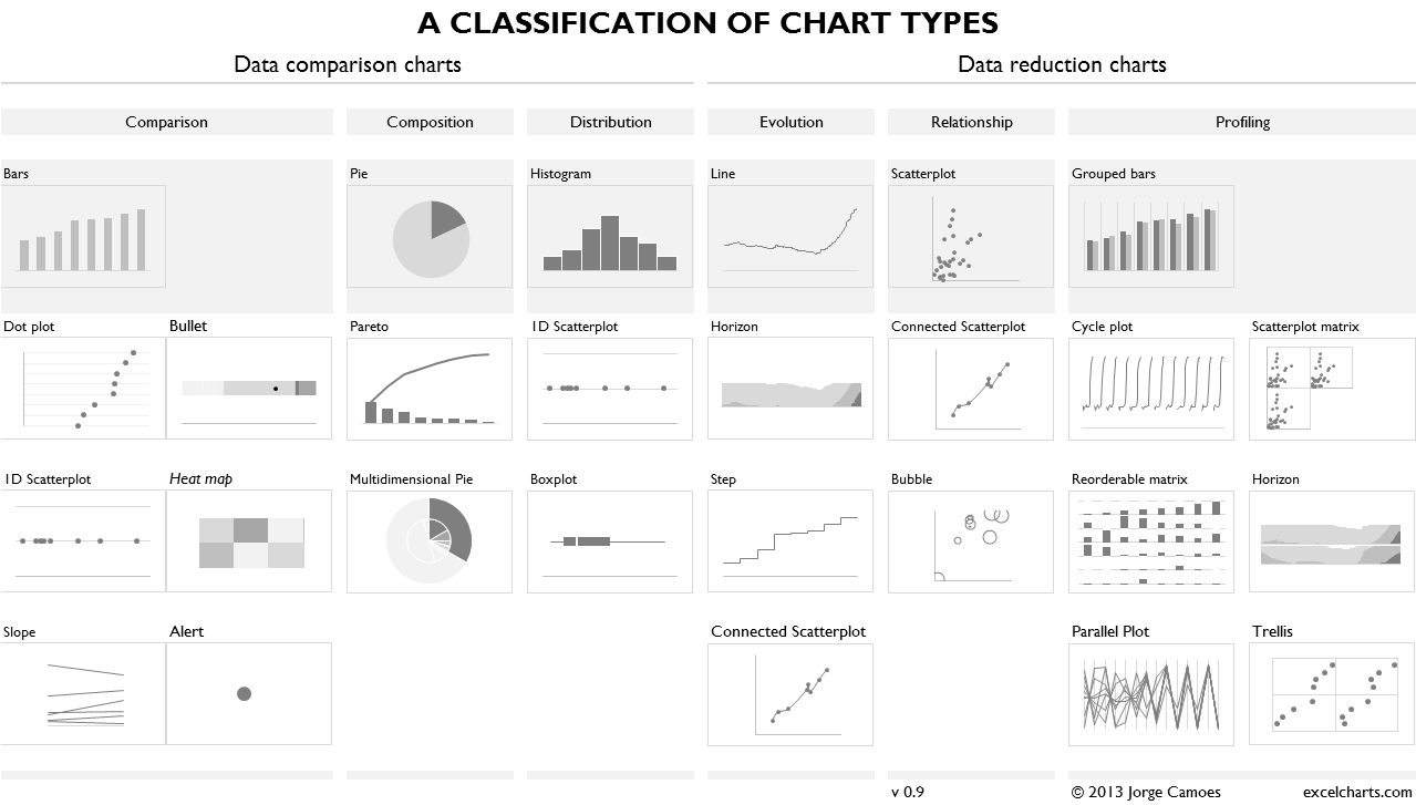
Graphical Marks & Properties
Marks and properties list

Bertin, Jacques. "Semiology of graphics: diagrams, networks, maps." (1967).
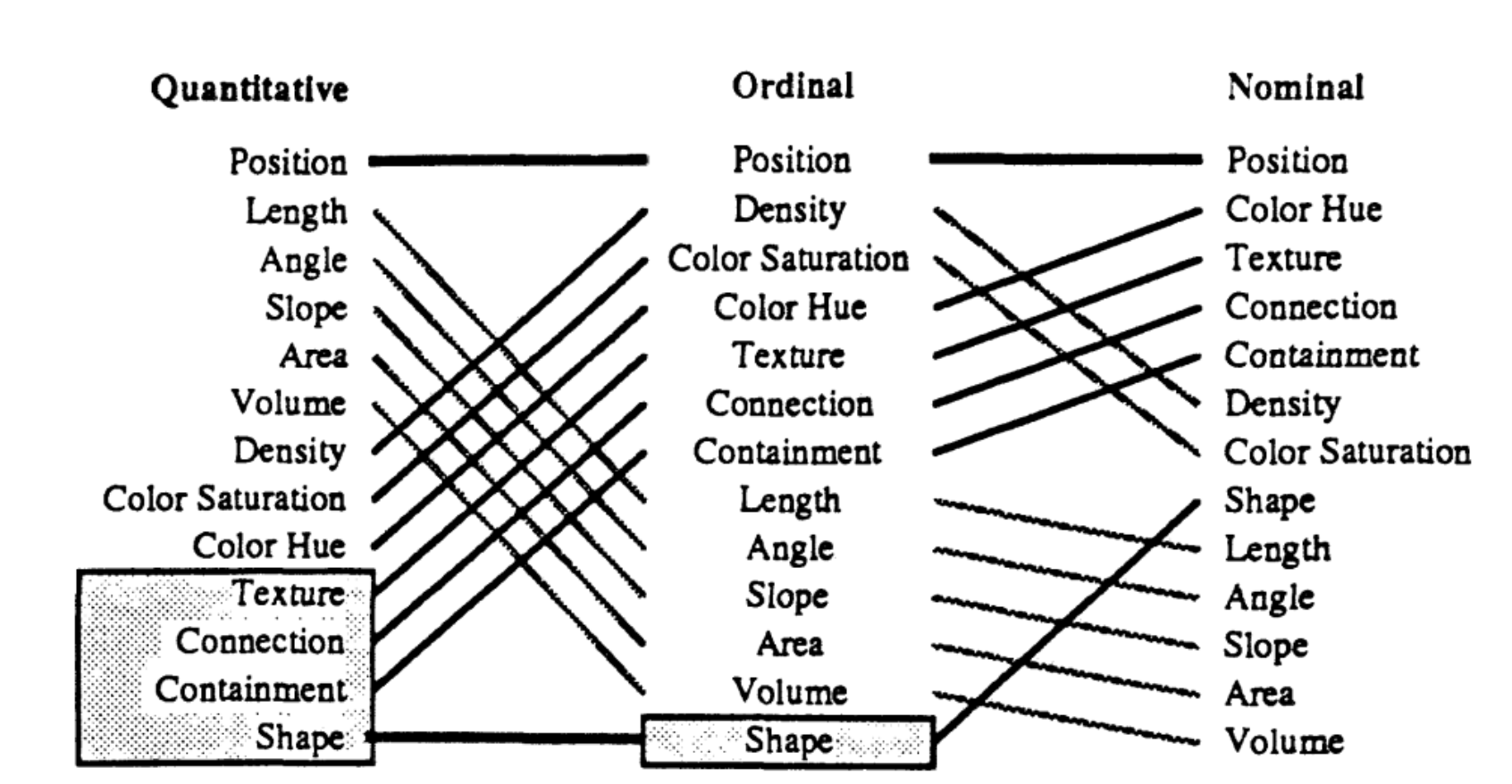
Marks and properties variations
Bertin, Jacques. "Semiology of graphics: diagrams, networks, maps." (1967).
Ranking of graphical marks

Mackinlay, Jock. "Automating the design of graphical presentations of relational information." Acm Transactions On Graphics (Tog) 5.2 (1986): 110-141.
Ranking of graphical marks by data type
Mackinlay, Jock. "Automating the design of graphical presentations of relational information." Acm Transactions On Graphics (Tog) 5.2 (1986): 110-141.
Visualization Templates (or Charts)
Visualization templates can be seen as pre-defined and (usually) well accepted combinations. See The Data Visualisation Catalogue http://www.datavizcatalogue.com/search.html.
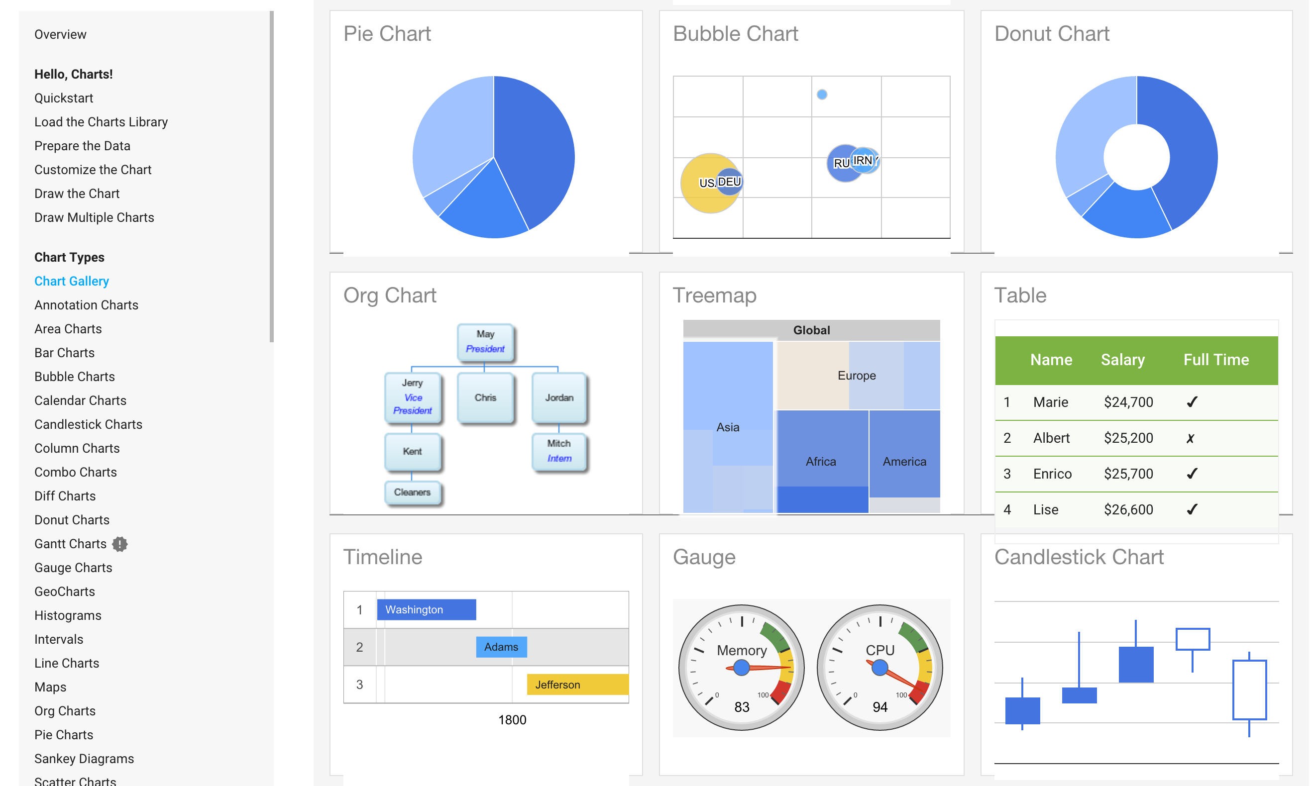
Tableau Software: Show Me!

Mackinlay J, Hanrahan P, Stolte C. Show me: automatic presentation for visual analysis. IEEE Trans Vis Comput Graph. 2007 Nov-Dec;13(6):1137-44.
Tableau Software: Drag & Drop

Tableau has a 10-12 year jump on Microsoft here and is a swiss army knife when it comes to data sources. Tableau does monthly updates as well with a big release or 2 every year. Still a much easier product to use and deploy at scale.
Raw by designdensity
Raw - Basic Tutorial from DensityDesign on Vimeo.
Vega

Vega charts configuration editor. You borrow configuration from existing templates. Extend them or override. JSON objects as configurations.
Trifacta Visual Profiler
https://www.trifacta.com/visual-profiling-for-data-transformation/

Trifacta data wrangler, shows most frequent values, outliers or potential variable transformations. http://vis.stanford.edu/papers/wrangler. See also Google Open Refine http://openrefine.org/.
Data Voyager

Data Voyager automatically generates charts with no input by default (besides loading the dataset). You can interact to get more details and bookmark them.
D3 for low-level control on visualization
d3. Highchart, NVD3, Rickshaw + their framweork-specific charts (React, ember, ..) and editor. See full list on http://keshif.me/demo/VisTools or http://www.jsgraphs.com/.
Resources
Jobs
<data-vis-jobs@googlegroups.com>
Social media
- Twitter #dataviz
- Twitter lists https://twitter.com/infobeautyaward/lists/data-visualisation-people
- LinkedIn topic https://www.linkedin.com/topic/dataviz
- Reddit data is beautiful (top 50 sub-reddit), internet is beautiful, some random discussion thread
Learn more
- Books: Design for Information, Visualization Analysis and Design.
- Design processes explained http://animateddata.co.uk/articles/f1-timeline-design/
- Watch Mike Bostock -
- Mooc https://twitter.com/YuriEngelhardt/status/697349217027780609
- Color http://colorbrewer2.org/
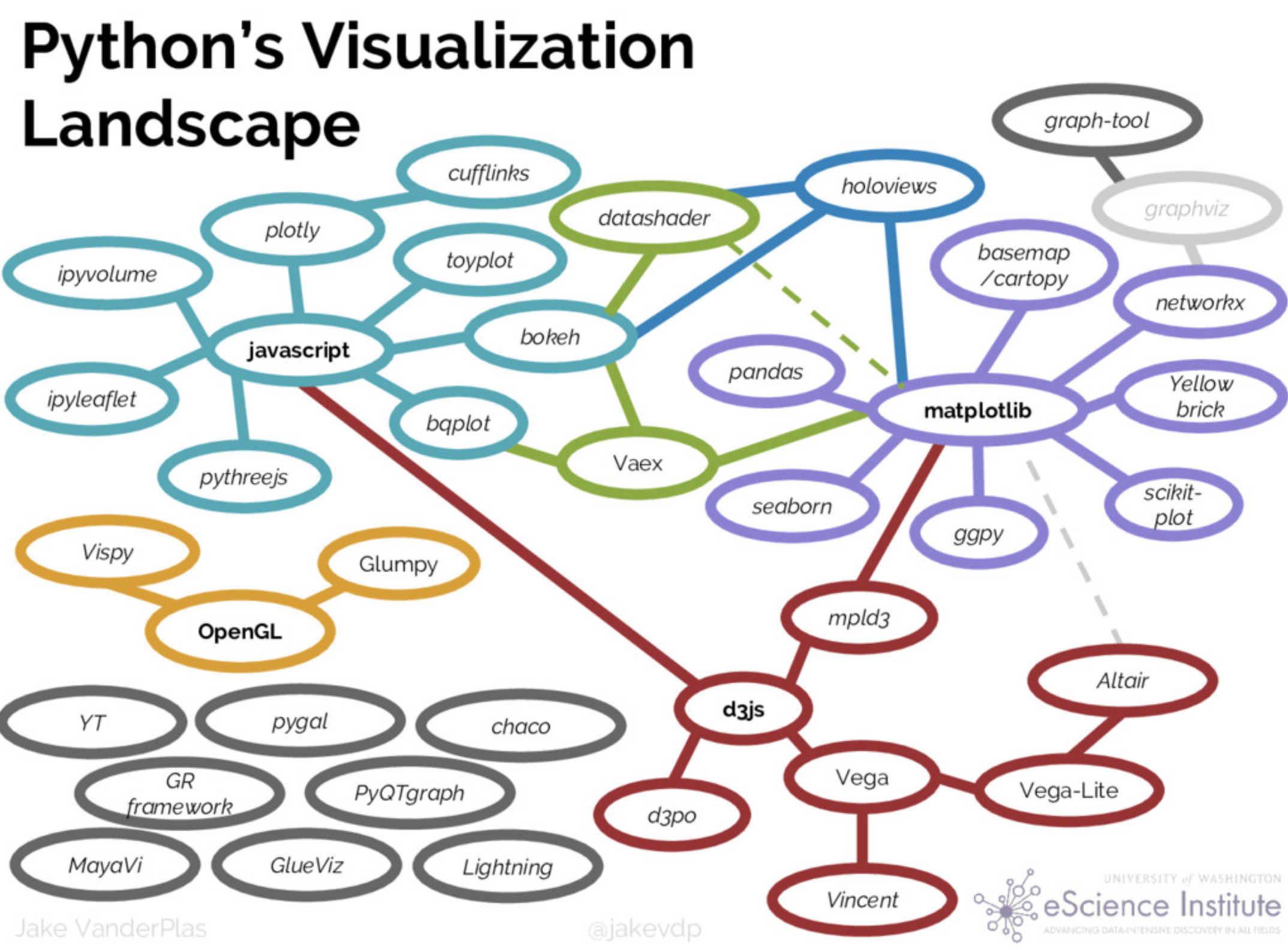
DataViz + Python
Data exploration examples with Seaborn
import numpy as np
from numpy.random import randn
import pandas as pd
from scipy import stats
import matplotlib as mpl
import matplotlib.pyplot as plt
import seaborn as sns
%matplotlib inline
data = randn(75)
plt.hist(data);
plt.hist(data, 20, color=sns.desaturate("indianred", .75));

data1 = stats.poisson(2).rvs(100)
data2 = stats.poisson(5).rvs(100)
max_data = np.r_[data1, data2].max()
bins = np.linspace(0, max_data, max_data + 1)
plt.hist(data1, bins, normed=True, color="#6495ED", alpha=.5)
plt.hist(data2, bins, normed=True, color="#F08080", alpha=.5);

plt.scatter(data1, data2)

with sns.axes_style("white"):
    sns.jointplot(data1, data2);

x = stats.gamma(3).rvs(5000)
plt.hist(x, 70, histtype="stepfilled", alpha=.7);

y = stats.gamma(3).rvs(5000)
plt.hist(x, 70, histtype="stepfilled", alpha=.7);
with sns.axes_style("white"):
    sns.jointplot(x, y);

with sns.axes_style("white"):
    sns.jointplot(x, y, alpha=.1);

with sns.axes_style("white"):
    sns.jointplot(x, y, kind="hex");

sns.rugplot(data);

plt.hist(data, alpha=.3)
sns.rugplot(data);

sns.distplot(data, kde=False, rug=True);

sns.set(rc={"figure.figsize": (6, 6)})
data = [data1, data2]
plt.boxplot(data);

normals = pd.Series(np.random.normal(size=10))
normals.plot()

variables = pd.DataFrame({'normal': np.random.normal(size=100),
                       'gamma': np.random.gamma(1, size=100),
                       'poisson': np.random.poisson(size=100)})
variables.cumsum(0).plot()

variables.cumsum(0).plot(subplots=True)