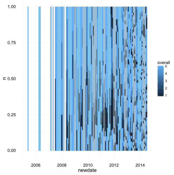
 | This stacked bar mistake would look great as an area rug.
via @kara_woo |
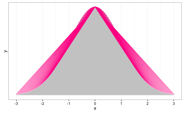 | I was just trying to draw a normal distribution now I have a weird impulse to pray to this thing.
via @mhairihmcneill
... |
 | When a dynamical system gets out of control. via Valentina Staneva |
 | Was intended to be a masked raster layer showing areas of high vegetation greenness across an RGB image of Lower Teakettle, CA.... |
 | Some modern aRt via @enlasnebulosas |
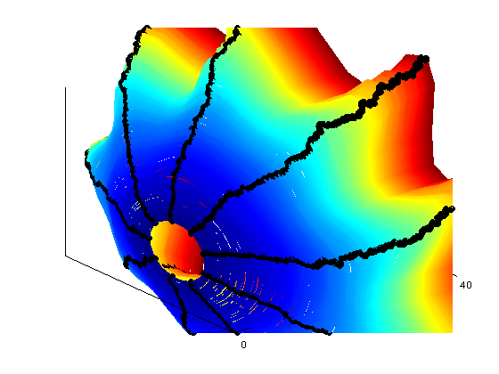
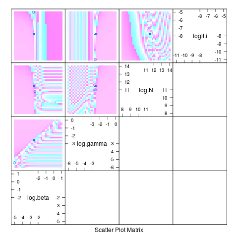 | I’m not all that happy with this likelihood surface … via @bolkerb |
 | (Modified) bivariate trace plots of effect estimates from MCMC sampling
via @TweetNTD |
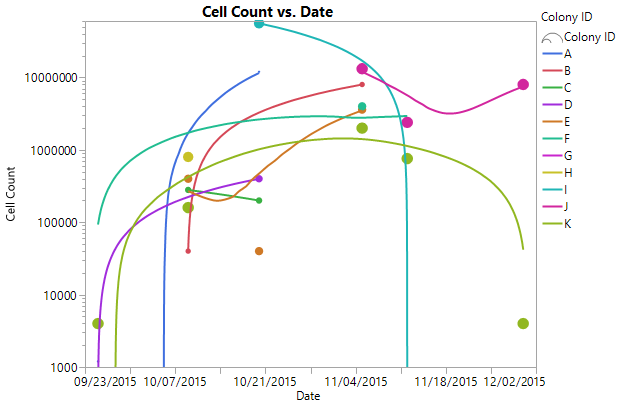 | Fluctuating microbial populations in a spontaneously fermented Riesling wine from the Finger Lakes AVA, New York. via Patrick... |
 | I was trying to plot the distance (in x, y, and z coordinates) between an orbiting satellite and a fixed point on the ground.... |
 | I was trying to plot variance in random walk end positions in 1000 replicates of 100 walks …. something went horribly wrong. ... |
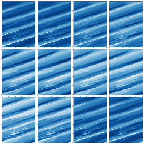 | I tried to rotate some African environmental rasters but clearly messed it up. I like having the panels and how the diagonal... |
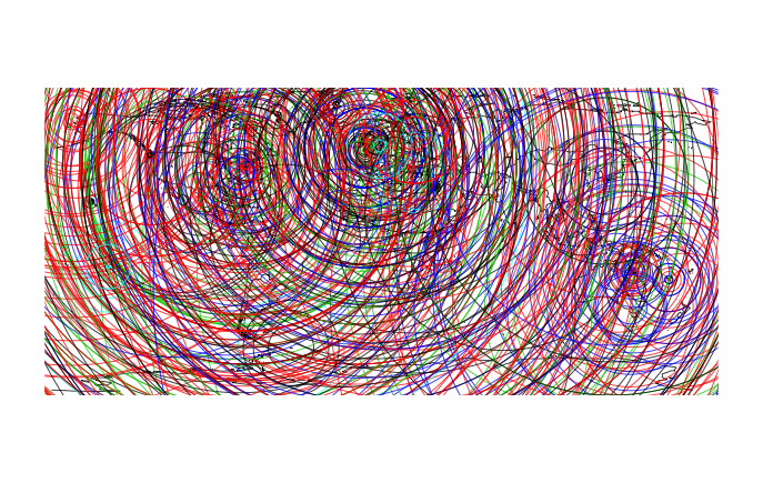
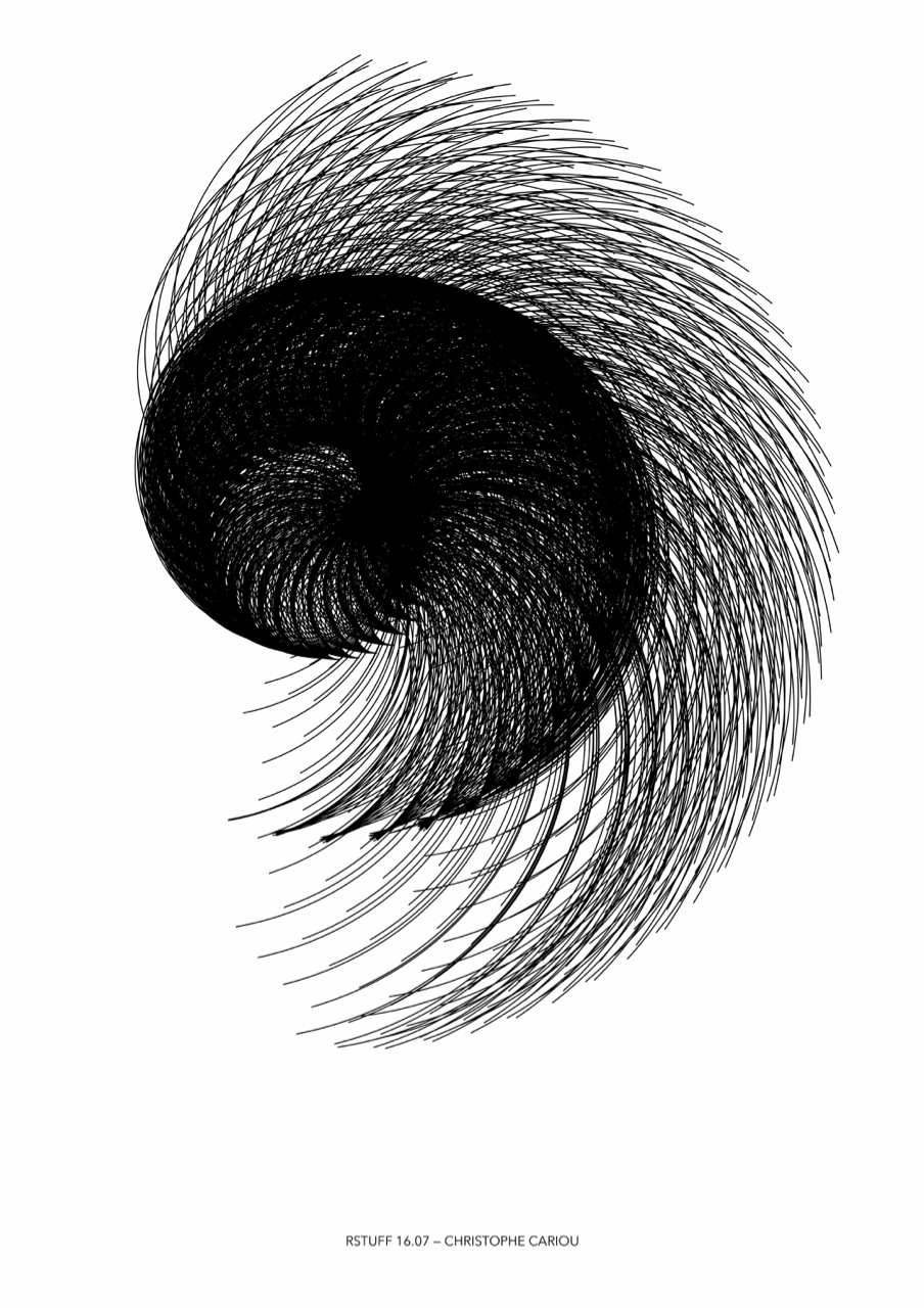 | A beautiful error in my program on the spirals. I was doing some tests to see if the spiral could be used to connect the dots... |
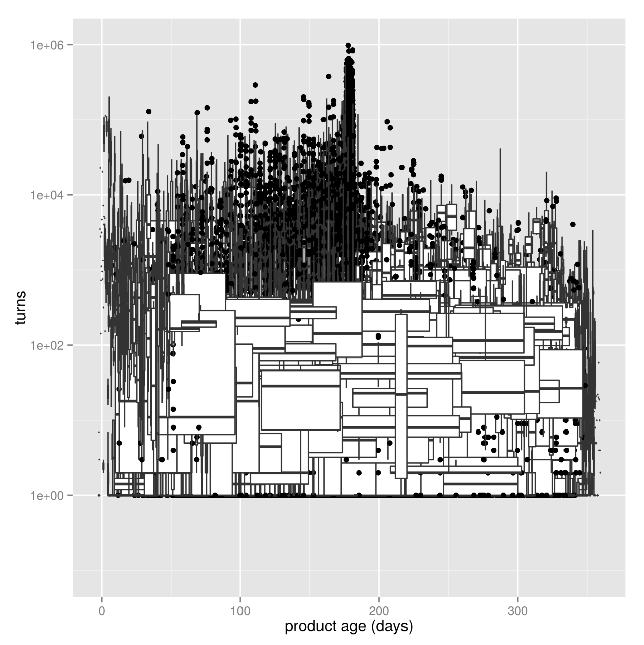
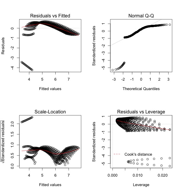 | This may be bad news for my regression, but the plots sure are fun to look at! via Elinor |
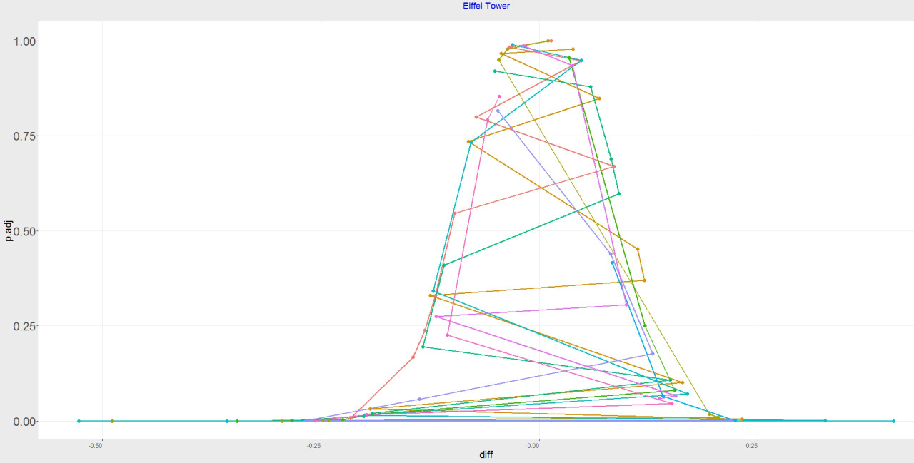 | Accidentally got the Eiffel Tower :P via fitzherbirth |
 | Regarding demographics of sales data,
I could a tale unfold whose lightest word
Would harrow up thy soul, freeze thy young... |
 | I’m willing to bet that I still have a 95% coverage with my two (overlaid colors make the third) confidence intervals. via... |
 | Tried to plot points relative to expression level. The output is aRt. via @sna8 |
 | A global map (underneath) of shelf sea nutrient fluxes where colour is season and size of circle is magnitude of flux. via... |
 | Somehow, I mixed up groups with boxplots and out popped this ugly tangle. via steven |
 | Trying to automate a time-series plot led to minimalism in black and blue. via Stijn |
| I was just trying to draw a normal distribution now I have a weird impulse to pray to this thing.
via @mhairihmcneill
... |
| When a dynamical system gets out of control. via Valentina Staneva |
| Was intended to be a masked raster layer showing areas of high vegetation greenness across an RGB image of Lower Teakettle, CA.... |
| Some modern aRt via @enlasnebulosas |
| I’m not all that happy with this likelihood surface … via @bolkerb |
| (Modified) bivariate trace plots of effect estimates from MCMC sampling
via @TweetNTD |
| Fluctuating microbial populations in a spontaneously fermented Riesling wine from the Finger Lakes AVA, New York. via Patrick... |
| I was trying to plot the distance (in x, y, and z coordinates) between an orbiting satellite and a fixed point on the ground.... |
| I was trying to plot variance in random walk end positions in 1000 replicates of 100 walks …. something went horribly wrong. ... |
| I tried to rotate some African environmental rasters but clearly messed it up. I like having the panels and how the diagonal... |
| A beautiful error in my program on the spirals. I was doing some tests to see if the spiral could be used to connect the dots... |
| This may be bad news for my regression, but the plots sure are fun to look at! via Elinor |
| Accidentally got the Eiffel Tower :P via fitzherbirth |
| Regarding demographics of sales data,
I could a tale unfold whose lightest word
Would harrow up thy soul, freeze thy young... |
| I’m willing to bet that I still have a 95% coverage with my two (overlaid colors make the third) confidence intervals. via... |
| Tried to plot points relative to expression level. The output is aRt. via @sna8 |
| A global map (underneath) of shelf sea nutrient fluxes where colour is season and size of circle is magnitude of flux. via... |
| Somehow, I mixed up groups with boxplots and out popped this ugly tangle. via steven |
| Trying to automate a time-series plot led to minimalism in black and blue. via Stijn |
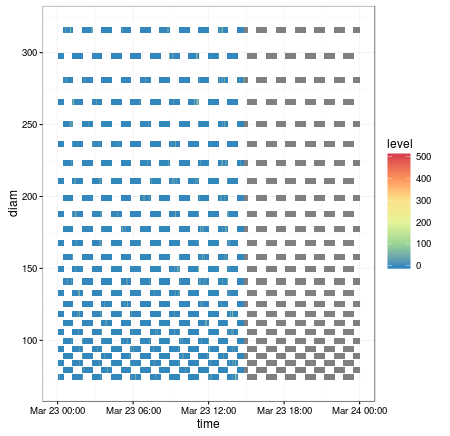
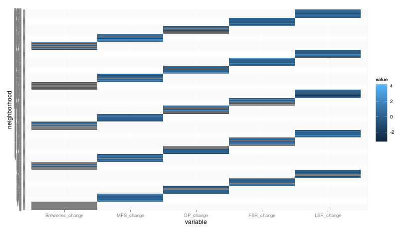 | Either a bad factoring job or a suggestion for a new ggplot2 function: geom_heatmap_stairsteps
via @zachstednick |
| When a dynamical system gets out of control. via Valentina Staneva |
| Was intended to be a masked raster layer showing areas of high vegetation greenness across an RGB image of Lower Teakettle, CA.... |
| Some modern aRt via @enlasnebulosas |
| I’m not all that happy with this likelihood surface … via @bolkerb |
| (Modified) bivariate trace plots of effect estimates from MCMC sampling
via @TweetNTD |
| Fluctuating microbial populations in a spontaneously fermented Riesling wine from the Finger Lakes AVA, New York. via Patrick... |
| I was trying to plot the distance (in x, y, and z coordinates) between an orbiting satellite and a fixed point on the ground.... |
| I was trying to plot variance in random walk end positions in 1000 replicates of 100 walks …. something went horribly wrong. ... |
| I tried to rotate some African environmental rasters but clearly messed it up. I like having the panels and how the diagonal... |
| A beautiful error in my program on the spirals. I was doing some tests to see if the spiral could be used to connect the dots... |
| This may be bad news for my regression, but the plots sure are fun to look at! via Elinor |
| Accidentally got the Eiffel Tower :P via fitzherbirth |
| Regarding demographics of sales data,
I could a tale unfold whose lightest word
Would harrow up thy soul, freeze thy young... |
| I’m willing to bet that I still have a 95% coverage with my two (overlaid colors make the third) confidence intervals. via... |
| Tried to plot points relative to expression level. The output is aRt. via @sna8 |
| A global map (underneath) of shelf sea nutrient fluxes where colour is season and size of circle is magnitude of flux. via... |
| Somehow, I mixed up groups with boxplots and out popped this ugly tangle. via steven |
| Trying to automate a time-series plot led to minimalism in black and blue. via Stijn |
| Either a bad factoring job or a suggestion for a new ggplot2 function: geom_heatmap_stairsteps
via @zachstednick |
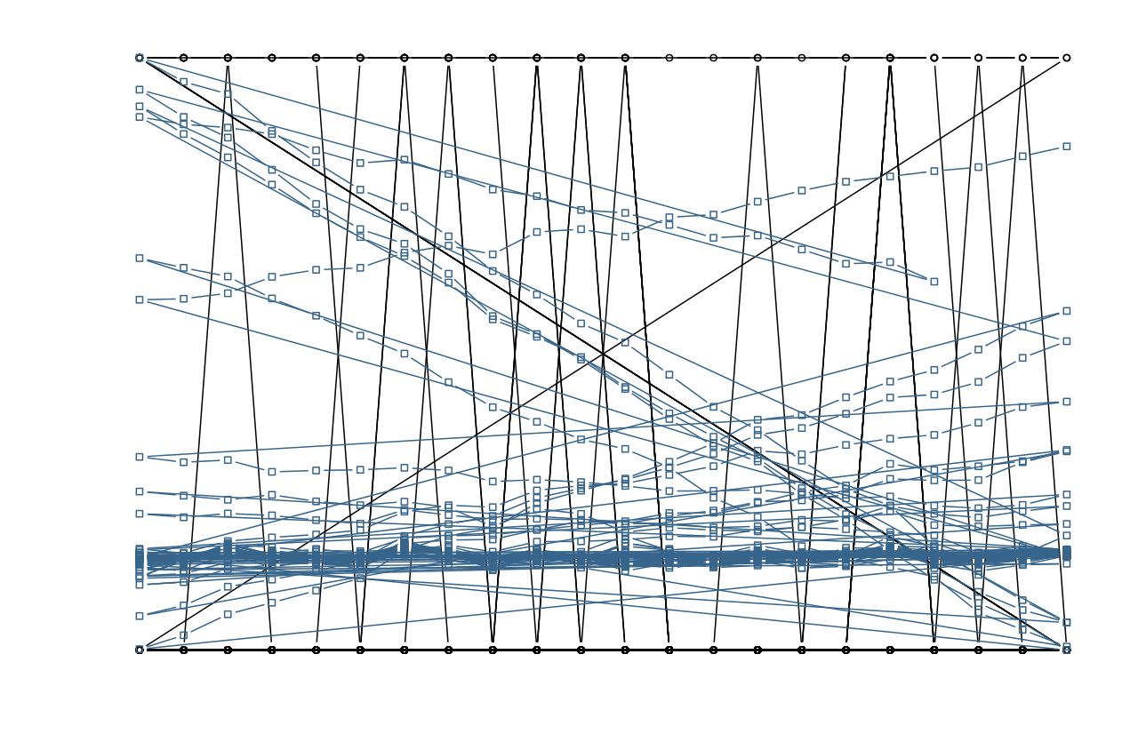
 | # Title: Urban connections # Author: Elio Amicarelli # Description: The author was trying to visualize the decision boundary for... |
| Was intended to be a masked raster layer showing areas of high vegetation greenness across an RGB image of Lower Teakettle, CA.... |
| Some modern aRt via @enlasnebulosas |
| I’m not all that happy with this likelihood surface … via @bolkerb |
| (Modified) bivariate trace plots of effect estimates from MCMC sampling
via @TweetNTD |
| Fluctuating microbial populations in a spontaneously fermented Riesling wine from the Finger Lakes AVA, New York. via Patrick... |
| I was trying to plot the distance (in x, y, and z coordinates) between an orbiting satellite and a fixed point on the ground.... |
| I was trying to plot variance in random walk end positions in 1000 replicates of 100 walks …. something went horribly wrong. ... |
| I tried to rotate some African environmental rasters but clearly messed it up. I like having the panels and how the diagonal... |
| A beautiful error in my program on the spirals. I was doing some tests to see if the spiral could be used to connect the dots... |
| This may be bad news for my regression, but the plots sure are fun to look at! via Elinor |
| Accidentally got the Eiffel Tower :P via fitzherbirth |
| Regarding demographics of sales data,
I could a tale unfold whose lightest word
Would harrow up thy soul, freeze thy young... |
| I’m willing to bet that I still have a 95% coverage with my two (overlaid colors make the third) confidence intervals. via... |
| Tried to plot points relative to expression level. The output is aRt. via @sna8 |
| A global map (underneath) of shelf sea nutrient fluxes where colour is season and size of circle is magnitude of flux. via... |
| Somehow, I mixed up groups with boxplots and out popped this ugly tangle. via steven |
| Trying to automate a time-series plot led to minimalism in black and blue. via Stijn |
| Either a bad factoring job or a suggestion for a new ggplot2 function: geom_heatmap_stairsteps
via @zachstednick |
| # Title: Urban connections # Author: Elio Amicarelli # Description: The author was trying to visualize the decision boundary for... |
 | When your streamgraph’s X-axis relies on JavaScript time parsing via unionben |
| Some modern aRt via @enlasnebulosas |
| I’m not all that happy with this likelihood surface … via @bolkerb |
| (Modified) bivariate trace plots of effect estimates from MCMC sampling
via @TweetNTD |
| Fluctuating microbial populations in a spontaneously fermented Riesling wine from the Finger Lakes AVA, New York. via Patrick... |
| I was trying to plot the distance (in x, y, and z coordinates) between an orbiting satellite and a fixed point on the ground.... |
| I was trying to plot variance in random walk end positions in 1000 replicates of 100 walks …. something went horribly wrong. ... |
| I tried to rotate some African environmental rasters but clearly messed it up. I like having the panels and how the diagonal... |
| A beautiful error in my program on the spirals. I was doing some tests to see if the spiral could be used to connect the dots... |
| This may be bad news for my regression, but the plots sure are fun to look at! via Elinor |
| Accidentally got the Eiffel Tower :P via fitzherbirth |
| Regarding demographics of sales data,
I could a tale unfold whose lightest word
Would harrow up thy soul, freeze thy young... |
| I’m willing to bet that I still have a 95% coverage with my two (overlaid colors make the third) confidence intervals. via... |
| Tried to plot points relative to expression level. The output is aRt. via @sna8 |
| A global map (underneath) of shelf sea nutrient fluxes where colour is season and size of circle is magnitude of flux. via... |
| Somehow, I mixed up groups with boxplots and out popped this ugly tangle. via steven |
| Trying to automate a time-series plot led to minimalism in black and blue. via Stijn |
| Either a bad factoring job or a suggestion for a new ggplot2 function: geom_heatmap_stairsteps
via @zachstednick |
| # Title: Urban connections # Author: Elio Amicarelli # Description: The author was trying to visualize the decision boundary for... |
| When your streamgraph’s X-axis relies on JavaScript time parsing via unionben |
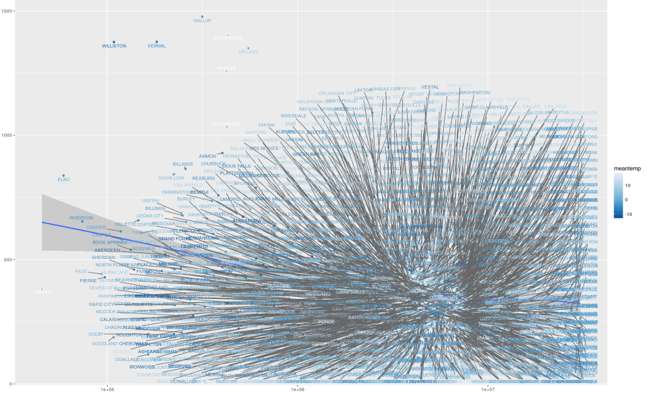
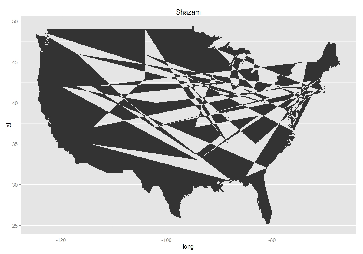 | This map of the US needs a bit more work. via willbmisled |
| I’m not all that happy with this likelihood surface … via @bolkerb |
| (Modified) bivariate trace plots of effect estimates from MCMC sampling
via @TweetNTD |
| Fluctuating microbial populations in a spontaneously fermented Riesling wine from the Finger Lakes AVA, New York. via Patrick... |
| I was trying to plot the distance (in x, y, and z coordinates) between an orbiting satellite and a fixed point on the ground.... |
| I was trying to plot variance in random walk end positions in 1000 replicates of 100 walks …. something went horribly wrong. ... |
| I tried to rotate some African environmental rasters but clearly messed it up. I like having the panels and how the diagonal... |
| A beautiful error in my program on the spirals. I was doing some tests to see if the spiral could be used to connect the dots... |
| This may be bad news for my regression, but the plots sure are fun to look at! via Elinor |
| Accidentally got the Eiffel Tower :P via fitzherbirth |
| Regarding demographics of sales data,
I could a tale unfold whose lightest word
Would harrow up thy soul, freeze thy young... |
| I’m willing to bet that I still have a 95% coverage with my two (overlaid colors make the third) confidence intervals. via... |
| Tried to plot points relative to expression level. The output is aRt. via @sna8 |
| A global map (underneath) of shelf sea nutrient fluxes where colour is season and size of circle is magnitude of flux. via... |
| Somehow, I mixed up groups with boxplots and out popped this ugly tangle. via steven |
| Trying to automate a time-series plot led to minimalism in black and blue. via Stijn |
| Either a bad factoring job or a suggestion for a new ggplot2 function: geom_heatmap_stairsteps
via @zachstednick |
| # Title: Urban connections # Author: Elio Amicarelli # Description: The author was trying to visualize the decision boundary for... |
| When your streamgraph’s X-axis relies on JavaScript time parsing via unionben |
| This map of the US needs a bit more work. via willbmisled |
 | Forgot to mask a functional fMRI dataset, and a preprocessing step left this as the dataset. via Your brain on rock |
| (Modified) bivariate trace plots of effect estimates from MCMC sampling
via @TweetNTD |
| Fluctuating microbial populations in a spontaneously fermented Riesling wine from the Finger Lakes AVA, New York. via Patrick... |
| I was trying to plot the distance (in x, y, and z coordinates) between an orbiting satellite and a fixed point on the ground.... |
| I was trying to plot variance in random walk end positions in 1000 replicates of 100 walks …. something went horribly wrong. ... |
| I tried to rotate some African environmental rasters but clearly messed it up. I like having the panels and how the diagonal... |
| A beautiful error in my program on the spirals. I was doing some tests to see if the spiral could be used to connect the dots... |
| This may be bad news for my regression, but the plots sure are fun to look at! via Elinor |
| Accidentally got the Eiffel Tower :P via fitzherbirth |
| Regarding demographics of sales data,
I could a tale unfold whose lightest word
Would harrow up thy soul, freeze thy young... |
| I’m willing to bet that I still have a 95% coverage with my two (overlaid colors make the third) confidence intervals. via... |
| Tried to plot points relative to expression level. The output is aRt. via @sna8 |
| A global map (underneath) of shelf sea nutrient fluxes where colour is season and size of circle is magnitude of flux. via... |
| Somehow, I mixed up groups with boxplots and out popped this ugly tangle. via steven |
| Trying to automate a time-series plot led to minimalism in black and blue. via Stijn |
| Either a bad factoring job or a suggestion for a new ggplot2 function: geom_heatmap_stairsteps
via @zachstednick |
| # Title: Urban connections # Author: Elio Amicarelli # Description: The author was trying to visualize the decision boundary for... |
| When your streamgraph’s X-axis relies on JavaScript time parsing via unionben |
| This map of the US needs a bit more work. via willbmisled |
| Forgot to mask a functional fMRI dataset, and a preprocessing step left this as the dataset. via Your brain on rock |
 | Trying to draw my points in proportion to their weight in a model didn’t go quite right the first time… via Benno Simmons |
| Fluctuating microbial populations in a spontaneously fermented Riesling wine from the Finger Lakes AVA, New York. via Patrick... |
| I was trying to plot the distance (in x, y, and z coordinates) between an orbiting satellite and a fixed point on the ground.... |
| I was trying to plot variance in random walk end positions in 1000 replicates of 100 walks …. something went horribly wrong. ... |
| I tried to rotate some African environmental rasters but clearly messed it up. I like having the panels and how the diagonal... |
| A beautiful error in my program on the spirals. I was doing some tests to see if the spiral could be used to connect the dots... |
| This may be bad news for my regression, but the plots sure are fun to look at! via Elinor |
| Accidentally got the Eiffel Tower :P via fitzherbirth |
| Regarding demographics of sales data,
I could a tale unfold whose lightest word
Would harrow up thy soul, freeze thy young... |
| I’m willing to bet that I still have a 95% coverage with my two (overlaid colors make the third) confidence intervals. via... |
| Tried to plot points relative to expression level. The output is aRt. via @sna8 |
| A global map (underneath) of shelf sea nutrient fluxes where colour is season and size of circle is magnitude of flux. via... |
| Somehow, I mixed up groups with boxplots and out popped this ugly tangle. via steven |
| Trying to automate a time-series plot led to minimalism in black and blue. via Stijn |
| Either a bad factoring job or a suggestion for a new ggplot2 function: geom_heatmap_stairsteps
via @zachstednick |
| # Title: Urban connections # Author: Elio Amicarelli # Description: The author was trying to visualize the decision boundary for... |
| When your streamgraph’s X-axis relies on JavaScript time parsing via unionben |
| This map of the US needs a bit more work. via willbmisled |
| Forgot to mask a functional fMRI dataset, and a preprocessing step left this as the dataset. via Your brain on rock |
| Trying to draw my points in proportion to their weight in a model didn’t go quite right the first time… via Benno Simmons |
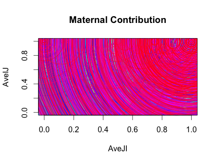
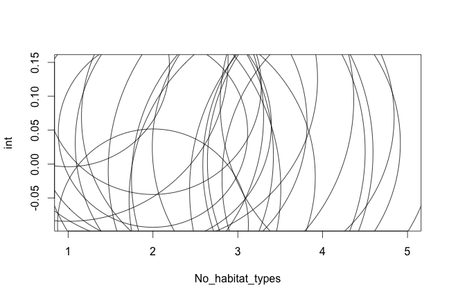
 | This was meant to be a plot of the variable selection process as a tuning parameter is changed (tuning parameter on the vertical... |
| I was trying to plot the distance (in x, y, and z coordinates) between an orbiting satellite and a fixed point on the ground.... |
| I was trying to plot variance in random walk end positions in 1000 replicates of 100 walks …. something went horribly wrong. ... |
| I tried to rotate some African environmental rasters but clearly messed it up. I like having the panels and how the diagonal... |
| A beautiful error in my program on the spirals. I was doing some tests to see if the spiral could be used to connect the dots... |
| This may be bad news for my regression, but the plots sure are fun to look at! via Elinor |
| Accidentally got the Eiffel Tower :P via fitzherbirth |
| Regarding demographics of sales data,
I could a tale unfold whose lightest word
Would harrow up thy soul, freeze thy young... |
| I’m willing to bet that I still have a 95% coverage with my two (overlaid colors make the third) confidence intervals. via... |
| Tried to plot points relative to expression level. The output is aRt. via @sna8 |
| A global map (underneath) of shelf sea nutrient fluxes where colour is season and size of circle is magnitude of flux. via... |
| Somehow, I mixed up groups with boxplots and out popped this ugly tangle. via steven |
| Trying to automate a time-series plot led to minimalism in black and blue. via Stijn |
| Either a bad factoring job or a suggestion for a new ggplot2 function: geom_heatmap_stairsteps
via @zachstednick |
| # Title: Urban connections # Author: Elio Amicarelli # Description: The author was trying to visualize the decision boundary for... |
| When your streamgraph’s X-axis relies on JavaScript time parsing via unionben |
| This map of the US needs a bit more work. via willbmisled |
| Forgot to mask a functional fMRI dataset, and a preprocessing step left this as the dataset. via Your brain on rock |
| Trying to draw my points in proportion to their weight in a model didn’t go quite right the first time… via Benno Simmons |
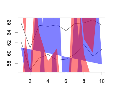
| This was meant to be a plot of the variable selection process as a tuning parameter is changed (tuning parameter on the vertical... |
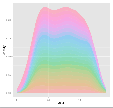 | accidentally stacked some density curves. found a rainbow instead.via Annie |